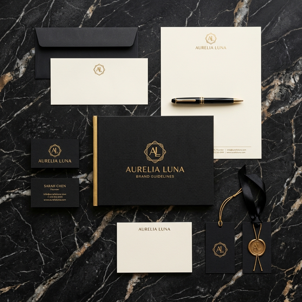
In a world saturated with visual noise, simplicity becomes a quiet declaration of confidence. Premium luxury brands rarely shout; they command attention through spatial restraint and tactile precision.
1. Negative Space as Value Signals
When redesigning the identity for Aurum Collective, we intentionally increased empty space around the primary typographic mark by 300%. This spatial buffer creates gravity and prestige.
“Luxury is defined not by what is added, but by what can be stripped away until only unassailable perfection remains.”